Juancho Café
Overview
Juancho Café is a coffee brand with personality. We designed a visual identity that reflects the warmth and energy of its café culture — from the logo to its brand applications.
Every element was crafted to stay consistent across print and digital touchpoints, giving the brand a recognizable voice and a solid foundation to grow.

Client
Juancho Café
Year
2024
Services
Branding & Naming Content Strategy Video Production Digital Ads Print/OOH Advertising Brochures & Collateral Point of Purchase Materials Sales Promotions
Challenge
Juancho Café needed a visual identity able to stand out in a crowded coffee market while staying true to the warmth of the coffee ritual — an identity flexible enough to live on a storefront, a cup and a social feed alike.
Insight
A cup of coffee is a precious pause in the day. The brand had to capture that feeling: the reflection of a perfectly brewed espresso, the energy of early mornings, the aroma of freshly roasted beans, and the sense of togetherness that naturally unfolds around coffee.
Solution
Inspired by the natural shapes of mountains and the earthy tones of nature, we crafted an identity that blends authenticity with contemporary design — from logo and typography to color palette and packaging, every element rooted in place, culture and craftsmanship.
Design System

A brand is more than a logo — it’s the story, the voice, and the experience we offer to the world.
This brand guideline was created to ensure that every expression of Juancho Café is consistent, clear, and true to our values. It serves as a reference for anyone who communicates on behalf of the brand, helping maintain visual and verbal coherence across all platforms.
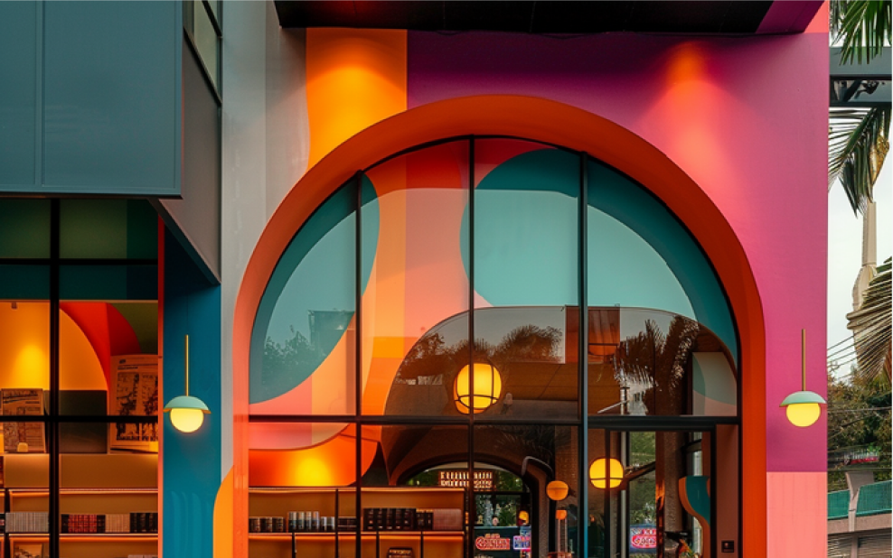
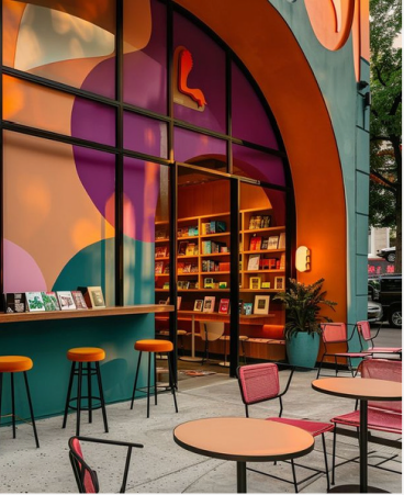
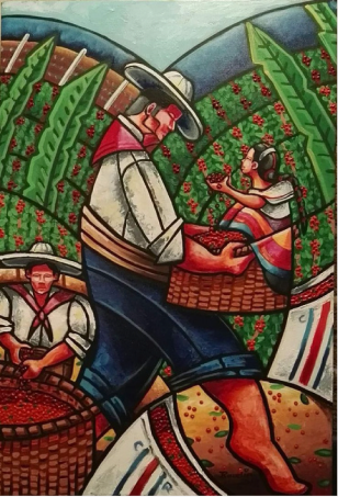
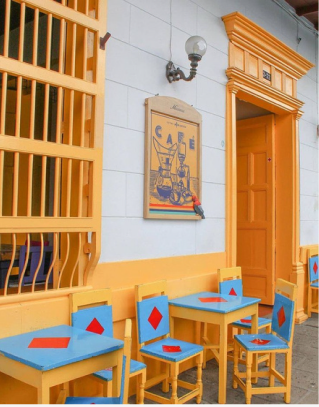

Design Thinking
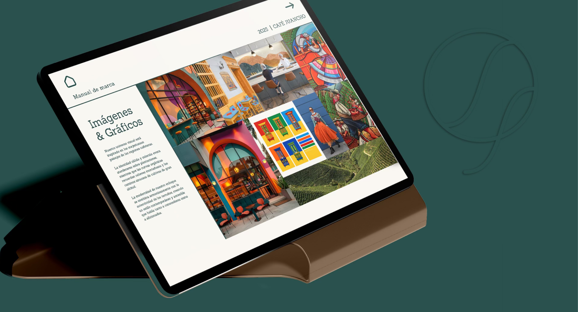
The branding concept process begins with a deep exploration of the coffee store’s essence—its story, audience, and sensory experience. Inspired by the natural shapes of mountains and the earthy tones of nature, we crafted a visual identity that blends authenticity with contemporary design.
The result is a brand that evokes the warmth, aroma, and craftsmanship of coffee, while reflecting a modern, grounded aesthetic. From logo and typography to color palette and packaging, every element is designed to create a cohesive, memorable experience rooted in place, culture, and creativity.

Logo Process
sketches


Color Palette
The visual identity is inspired by the warm, authentic world of coffee.
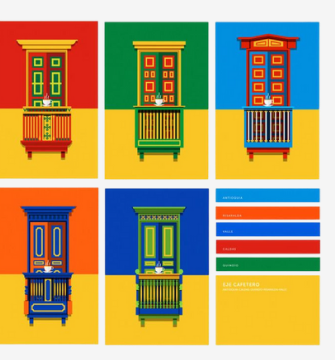
The color palette tells the story of a precious pause in the day. It begins with a deep, sophisticated tone that evokes the reflection of a perfectly brewed espresso. This elegant base is enriched with a warm hue reminiscent of early morning energy—those quiet moments when the aroma of coffee gently awakens us.
The third tone captures the very essence of our freshly roasted beans, while the final color brings a sense of togetherness—evoking the shared moments that naturally unfold around a cup of coffee.
Professionalism, elegance, sophistication
Dark Slate Gray
PANTONE 2466
HEX #2A514D
Energy, warmth, vitality
Golden Gate Bridge Orange
PANTONE 180 C
HEX #BE3A34
Roasted, handcrafted, aroma
Spanish Orange
PANTONE 180 C
HEX #D86018
Kindness, sharing
Princeton Orange
PANTONE 7577 C
HEX #DF7D33
Professionalism, elegance, sophistication
Dark Slate Gray
PANTONE 2466
HEX #2A514D
Energy, warmth, vitality
Golden Gate Bridge Orange
PANTONE 180 C
HEX #BE3A34
Roasted, handcrafted, aroma
Spanish Orange
PANTONE 180 C
HEX #D86018
Kindness, sharing
Princeton Orange
PANTONE 7577 C
HEX #DF7D33
A strong logo system includes multiple versions to ensure flexibility and consistency across all applications. From the primary logo to simplified marks, icons, and responsive formats, each version is designed to maintain brand integrity—whether on a website, social media, packaging, or print.
Logo versions

Integrated Version

Iconic Version
Fonts
The primary typeface, Tsukushi B Round Gothic, is used for all brand communications. It features rounded shapes that strike a perfect balance between modernity and human warmth, embodying a modern ranch-inspired spirit.
The secondary typeface, HanziPen SC, is used for decorative elements and emotional accents. Its handwritten style gives it an authentic, handcrafted feel, reinforcing our visual identity.
Applications
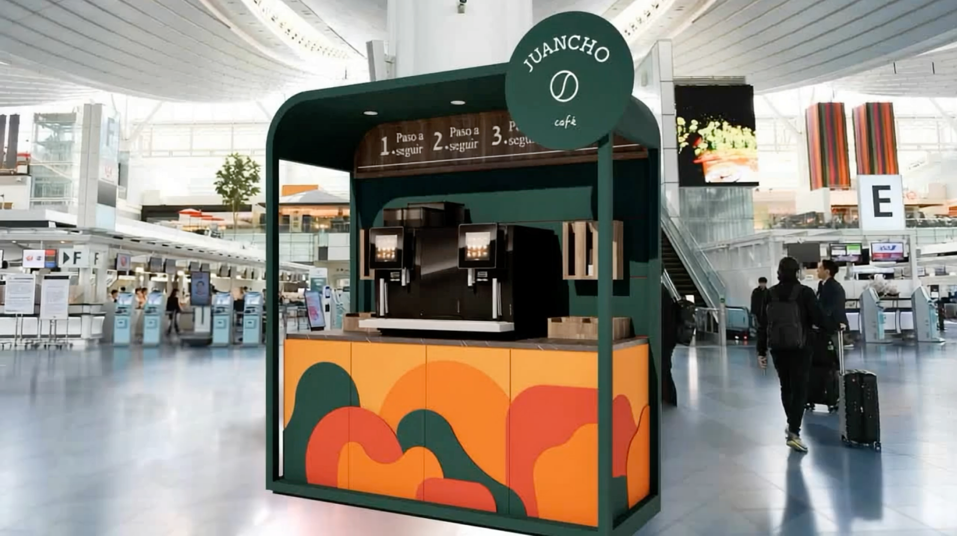
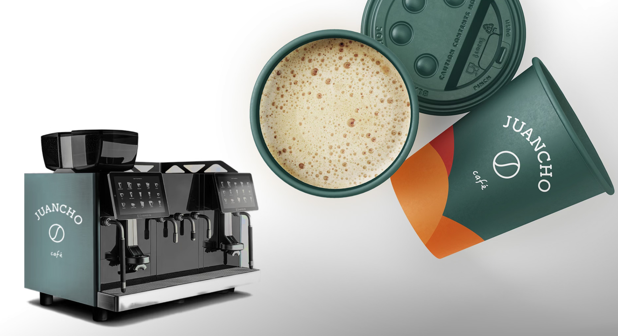
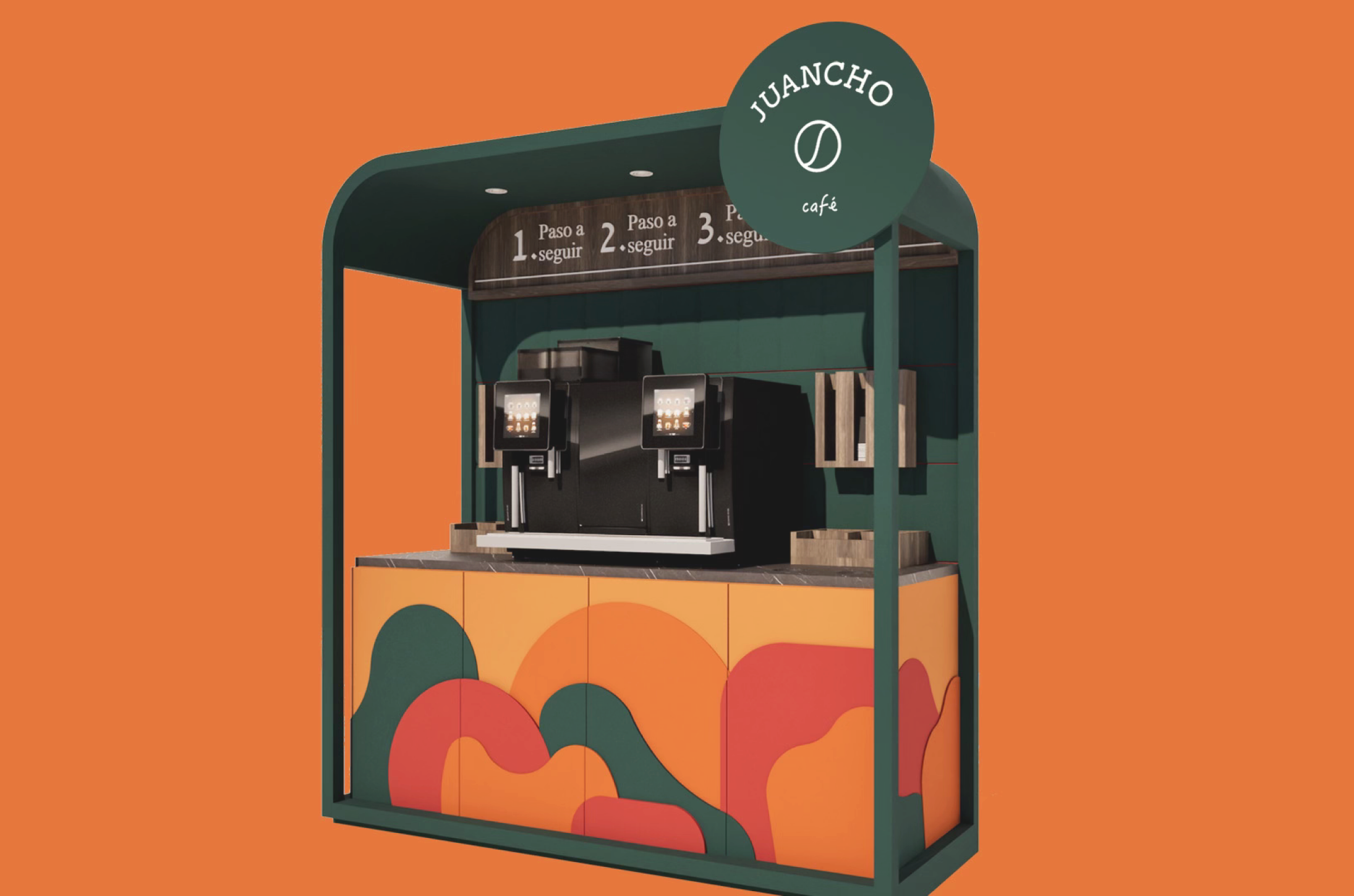
Visual applications bring a brand to life across every medium—digital, print, packaging, and environments. From social media templates and signage to merchandise and editorial layouts, consistent application ensures a cohesive and recognizable presence at every touchpoint. Each element is thoughtfully adapted to reflect the brand’s identity, tone, and values with clarity and impact.
Did you know?
Color alone can increase brand recognition by up to 80%—making consistent visual application a powerful business tool.